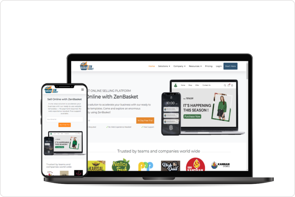
The popularity of mobile shopping has grown significantly in today's digital era, making it crucial for businesses to have a mobile-friendly Ecommerce website. Failure to provide a seamless mobile experience can result in customer dissatisfaction and missed sales opportunities. To address this, implementing a responsive design is key. Responsive design allows a website to adapt and effectively showcase its content on different screen sizes.
To meet this need, ZenBasket offers a mobile-responsive design solution with user-friendly features. By leveraging ZenBasket's capabilities, Ecommerce websites can better engage customers and increase their sales potential. This flexibility is crucial in ensuring a smooth user experience. Additionally, implementing a responsive design not only boosts traffic and sales but also improves overall website performance, targets the right audience, and presents a refined portfolio.
ZenBasket's Solution to optimize Mobile responsiveness
Having a mobile-friendly Ecommerce store provides a lot of benefits for businesses. Let's review some of ZenBasket's solutions that set your online store up for success.
Responsive Design for Every Screen
ZenBasket’s responsive design ensures that your site adapts effortlessly to all devices, from phones to tablets. Unlike static sites, ZenBasket resizes and reorders elements to suit each screen, making text readable, buttons tappable, and images clear. This functionality isn't just practical; it's the foundation of a positive shopping experience that makes browsing on mobile just as intuitive as on a desktop.
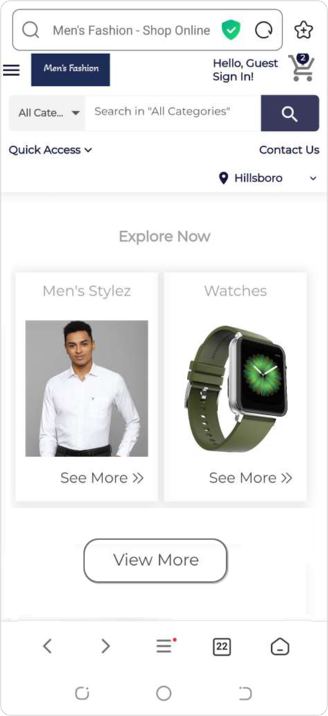
Simplify Navigation
A mobile shopper wants to find what they're looking for without having to dig through endless menus. ZenBasket delivers with a streamlined, tap-friendly navigation system that guides users effortlessly to key sections. ZenBasket thoughtfully organizes categories, product filters, and icons, creating an intuitive flow that helps customers quickly locate what they need. The result? A navigation experience that's as satisfying as it is simple

Streamline Checkout Process
Did you know that complicated checkouts cause almost 70% of shoppers to abandon their carts? ZenBasket's mobile checkout is optimized for simplicity, minimizing steps and eliminating unnecessary form fields. Shoppers can complete their purchase quickly, even as guests, without being slowed down by extra requirements. The streamlined process also features secure, mobile-friendly payment options, so customers can feel confident that their data is safe with each transaction.
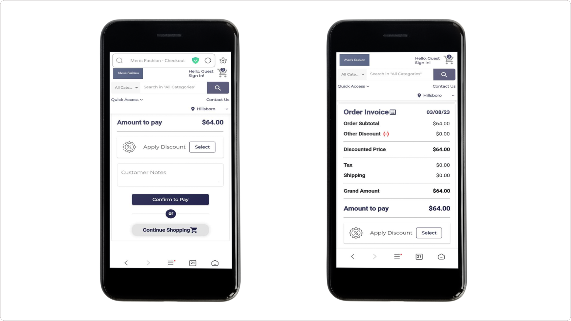
Prioritize Touch-Friendly Elements
In ZenBasket's mobile view, the menus are designed to work well with touchscreens, making it easy for you to navigate the website. They make sure that everything on the screen, like pictures and links, are the right size for different types of phones and tablets. They ensure that buttons and links are large enough to be easily tapped, provide ample spacing between elements to prevent accidental taps and use pop-ups to provide feedback on touch interactions. Elements are positioned to accommodate natural hand movements and gestures. By prioritizing touch-friendly elements, ZenBasket creates a user-friendly and enjoyable touchscreen experience.
Conclusion
In conclusion, having a mobile-friendly website is extremely important for an online store's success, with the increasing number of people using their phones for shopping. ZenBasket recognizes this need and offers a solution that ensures optimal performance and usability on mobile devices. The user-friendly design enables seamless and simplified shopping experiences on mobile devices. By utilizing ZenBasket, businesses can not only cater to their customers needs effectively but also achieve greater sales success in the competitive online shopping market.
Ready to make mobile your biggest competitive edge? ZenBasket is here to help you every step of the way.