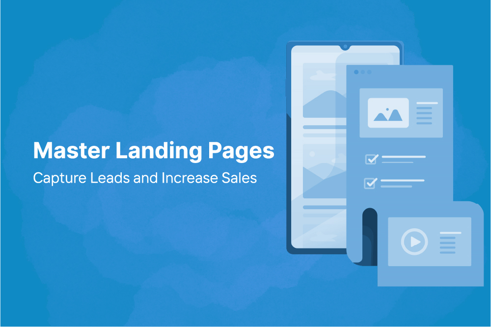
A landing page is a focused web page created for a single purpose-usually to get visitors to take action. Unlike your homepage, which may have multiple links and sections, a landing page is designed to capture attention and guide the visitor toward a specific goal, like signing up for a newsletter, downloading a resource, or making a purchase.
Think of it as your online pitch-a concise, persuasive introduction that leads visitors to act.
The Mechanics of a Landing Page
When someone clicks a link from an ad, email, or social post, they "land" on your page. Every element-from the headline to the images to the call-to-action (CTA)-works together to move them closer to completing your desired action.
A strong landing page achieves this by:
- Grabbing attention with a clear and compelling headline.
- Communicating value immediately through concise, benefit-driven copy.
- Building trust with social proof, testimonials, or client logos.
- Encouraging action through a well-placed, standout CTA.
The goal is simple: make it easy for visitors to take the next step without distractions.
The Anatomy of a High-Converting Landing Page
Now that we understand what a landing page is and how it works, let's break down how to create one that actually converts. We’ll approach it in key stages rather than rigid steps, so it’s easier to follow.
Crafting Your Headline and Copy
The headline is arguably the most important element of your landing page because it is the first thing visitors notice. A strong headline instantly communicates the main benefit or value your visitor will receive. Supporting copy should expand on this benefit and highlight key features without overwhelming the reader. Break the text into short paragraphs, use bullet points for clarity, and focus on benefits over features. The goal is to make the page scannable, persuasive, and easy to understand.
Designing a Clean, Focused Layout
A cluttered landing page can confuse and frustrate visitors, reducing conversions. Instead, focus on a clean, organized design that guides the user’s eye toward the primary CTA. Use whitespace effectively to create breathing room, choose clear typography, and ensure your color scheme highlights the most important elements. A visually balanced page not only looks professional but also helps visitors focus on your offer without distractions.
Using Visuals Strategically
Images, videos, or illustrations on a landing page should enhance the message rather than distract from it. Visuals can quickly demonstrate a product, show it in action, or illustrate the benefits you’re promoting. Authenticity is key-real photos, screenshots, or product demonstrations resonate more than generic stock images. A well-chosen visual can often communicate the value of your offer faster and more effectively than words alone.
Building Trust with Social Proof
Trust plays a vital role in convincing visitors to take action. Adding customer testimonials, reviews, ratings, or client logos provides social proof and reassures new visitors that your offer is credible. People are naturally influenced by the experiences of others, so sharing success stories or positive feedback helps build confidence in your product or service
Optimizing CTA, Forms, and Mobile Experience
The call-to-action (CTA) is the focal point of your landing page. Make it bold, visually distinct, and action-oriented with phrases like "Get Started," "Download Now," or "Start Free Trial." Position it strategically throughout the page to make it accessible at every scroll. Similarly, keep forms simple and ask only for essential information, such as name and email, to reduce friction. With most users browsing on mobile devices, ensure your landing page is fully responsive, loads quickly, and provides a seamless experience on small screens.
Test, Measure, and Improve
No landing page is perfect on the first try. Continuous testing and optimization are essential. Try different headlines, CTA placements, and visuals to see what resonates with your audience. Track performance metrics like conversion rates, bounce rates, and time on page to understand visitor behavior. Using this data to make informed changes ensures your landing page improves over time and continues to drive results.
Wrapping Up
Building a landing page that converts isn't magic-it's strategy.
It's about knowing your audience, focusing on one goal, and communicating clearly.
You don’t need to be a designer or a copywriter to make it work-just follow these steps, keep testing, and keep improving.
Remember: a great landing page doesn’t just look good.
It feels right-to your visitor, to your brand, and to your bottom line.