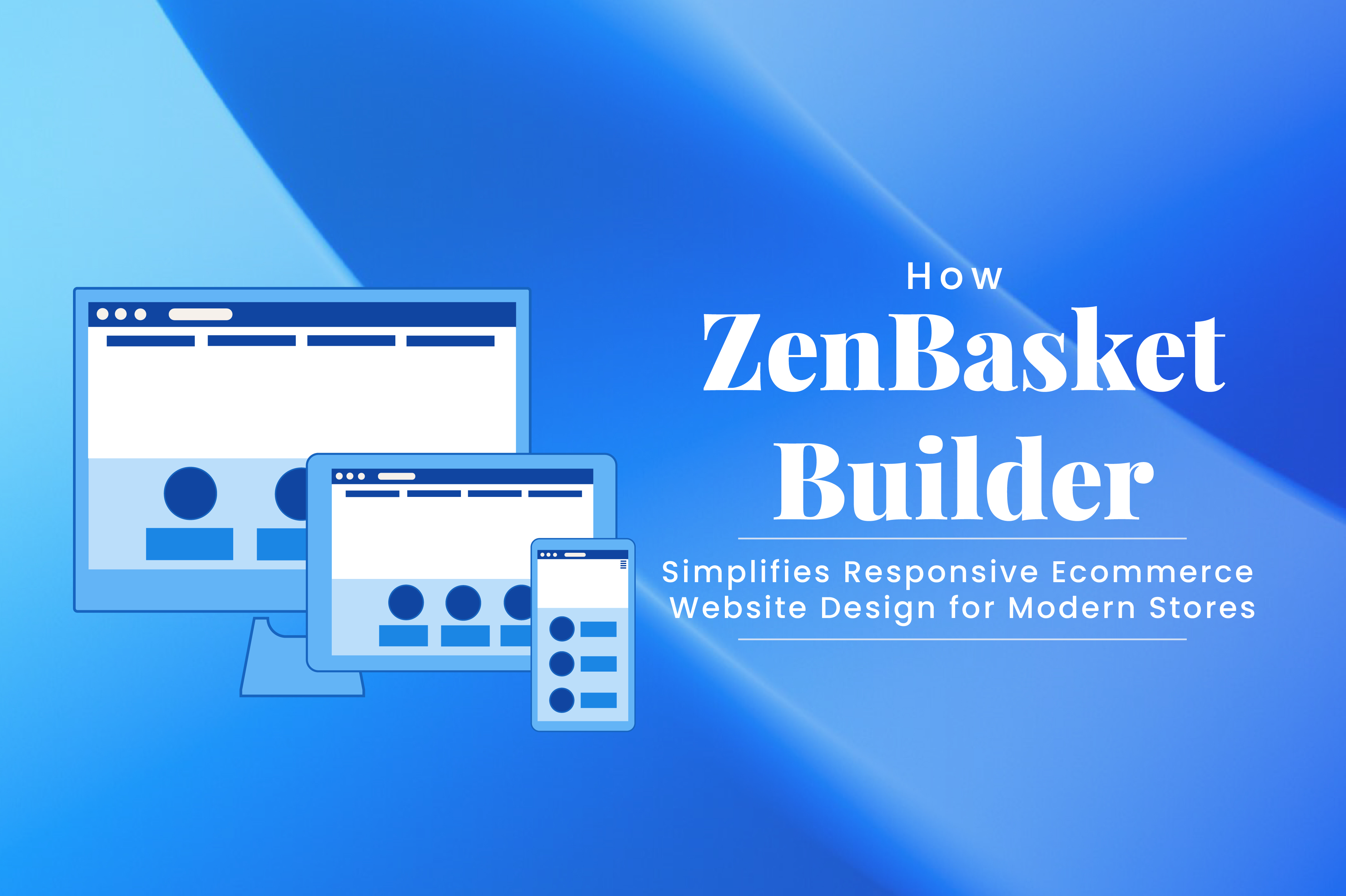
What is Responsive Ecommerce Website Design?
"Responsive ecommerce website design" means designing online stores so that all the key parts - product listings, navigation, images, checkout flows, etc. automatically adjust to different screen sizes (phones, tablets, desktops), orientations, and input types (mouse + keyboard, touch). It uses fluid images, media queries, and adaptive layouts so that shoppers get a seamless, optimized experience no matter what device they use.
Why Responsive Design is Non-Negotiable for Modern Online Stores
Simpler Site Management
With one unified design, updates become effortless. Whether you're adding new products, updating banners, or tweaking your layout, changes automatically adjust across all devices - no duplicate work needed.
Better SEO Rankings
Google loves mobile-friendly websites. Responsive design helps your store rank higher in search results, especially on mobile devices. One responsive site means a single URL, faster loading, and better indexing - all key factors for SEO success.
Capture Mobile Sales You Otherwise Lose
Most shoppers browse and buy from their phones today. If your site doesn't display or function properly on mobile, you're literally losing sales opportunities. A responsive store ensures every visitor - on any device - can explore, add to cart, and check out with ease.
Lower Maintenance & Cost Over Time
Maintaining one responsive website costs far less than running separate desktop and mobile versions. You save on development, hosting, and maintenance - while keeping your entire store consistent and easier to manage.
Better Conversion Rates & Usability
When your website is intuitive and frustration-free, customers stay longer and buy more. Smooth navigation, clear visuals, and effortless checkout all lead to higher conversion rates.
Future-Readiness
New devices (foldables, wearable screens, etc.) keep emerging. A responsive foundation helps your store adapt more easily to future screen sizes without full redesigns.
Why It's Easy to Build a Responsive Ecommerce Site with ZenBasket Builder
Building a fully responsive online store can sound complex, but ZenBasket Builder makes it remarkably simple. Here's how ZenBasket Builder simplifies responsive ecommerce website design:
Drag-and-Drop Responsive Editor
ZenBasket Builder's editor automatically adapts text, images, buttons, and other design elements across all screen sizes, ensuring layouts remain consistent on desktop, tablet, and mobile. With an intuitive, centralized interface for managing components, editing properties, and arranging sections, users can design fully responsive ecommerce stores quickly and effortlessly-no coding required.
Pre-Built Responsive Templates
For beginners or time-conscious store owners, ZenBasket Builder offers a library of ready-made, fully responsive templates. Each template is designed to work seamlessly across devices, enabling quick setup and easy customization while adhering to mobile-first best practices.
Device-Specific Customization Options
ZenBasket Builder lets you tailor your store for different devices, providing mobile-first layouts that automatically adjust while allowing custom edits for unique experiences on phones, tablets, or desktops. Elements, fonts, and spacing can be optimized per device without affecting other views, ensuring a truly responsive and user-friendly design. Edits in mobile mode affect only that view, keeping desktop layouts intact.
Auto-Scaling Media and Optimized Assets
High-quality visuals shouldn't slow down your site. ZenBasket Builder automatically resizes images and optimizes media assets to load fast and look crisp on any screen. Responsive videos, banners, and images adapt dynamically, improving user experience and page speed metrics-critical for both conversions and SEO.
Section-Based Design & Editing
ZenBasket Builder's section-based approach lets you drag, drop, and rearrange sections easily. Whether using pre-built sections or custom blank canvases, text, images, buttons, and videos can be adjusted in-line. Alignment, backgrounds, and spacing tools fine-tune layouts, making responsive design a matter of clicks rather than coding.
Dynamic Content & Page Flexibility
ZenBasket Builder ensures product lists, detail pages, and checkout forms are fully responsive:
- Product list pages: Customizable grids, filters, and product cards that scale across devices.
- Product detail pages: Flexible layouts for images, descriptions, reviews, and tabs that adjust automatically.
- Checkout & navigation: Intuitive, touch-friendly forms and menus designed to maintain usability and design consistency on all screens.
Reusable Design Components
Elements like banners, call-to-action sections, and product cards can be reused across multiple pages. They automatically scale across devices, ensuring a consistent brand experience without rebuilding layouts.
Dynamic Content & Page Flexibility
Responsive design in ZenBasket Builder goes beyond visuals. Pages can combine static and dynamic content-like live products, promotions, or store locations-while remaining fully responsive. This ensures your store adapts seamlessly as inventory or campaigns change, without compromising design integrity
Preview & Testing
ZenBasket Builder provides built-in preview and testing tools for desktop and mobile views. Designers can verify responsiveness before publishing, ensuring every user has an optimal experience. Once live, updates propagate instantly, and the lightweight editor maintains smooth performance for ongoing adjustments.
SEO & Performance Optimized
All responsive edits in ZenBasket Builder are optimized for speed and SEO. Auto-optimized images, responsive layouts, fast loading, and mobile-first design principles contribute to better search engine rankings while maintaining a visually appealing storefront.
Conclusion
A store that adapts seamlessly to every device improves user experience, increases conversions, enhances SEO, and simplifies maintenance. ZenBasket Builder empowers you to build fully responsive, visually stunning, and performance-optimized online stores effortlessly. With mobile-first templates, drag-and-drop editing, optimized images, and built-in testing tools, creating a responsive store has never been easier.
By investing in responsive design with ZenBasket Builder, you're not just creating a website-you're future-proofing your ecommerce business and ensuring your brand delivers a consistent, engaging experience for every customer, on every device.
FAQs
Is responsive design still relevant in 2025?
Absolutely. With most online shopping happening on mobile devices, responsive design is more essential than ever. It ensures that your ecommerce website looks and functions perfectly on any screen size-improving user experience, search engine rankings, and conversion rates. Tools like ZenBasket Builder make this process effortless by allowing you to design once and automatically adapt layouts across devices.
Do I need to test on real devices?
Yes. Previews are helpful, but real-device testing catches unique touch and rendering issues.
How does responsive design affect SEO?
It consolidates content, improves crawl efficiency, ensures mobile-first indexing, and contributes to faster load times-all positively impacting rankings.
Isn't a separate mobile site faster or better than a responsive design?
Historically, mobile-specific sites were common, but they introduce complexity, duplicate content, and SEO challenges. Responsive design uses one codebase and one URL per page, which is easier to maintain and better for SEO.
Does responsive mean we lose control over desktop layouts?
Not necessarily. Good responsive systems let you fine-tune layout and elements per device (desktop, tablet, mobile) while preserving consistency. ZenBasket Builder design editor will give control while preserving responsiveness.