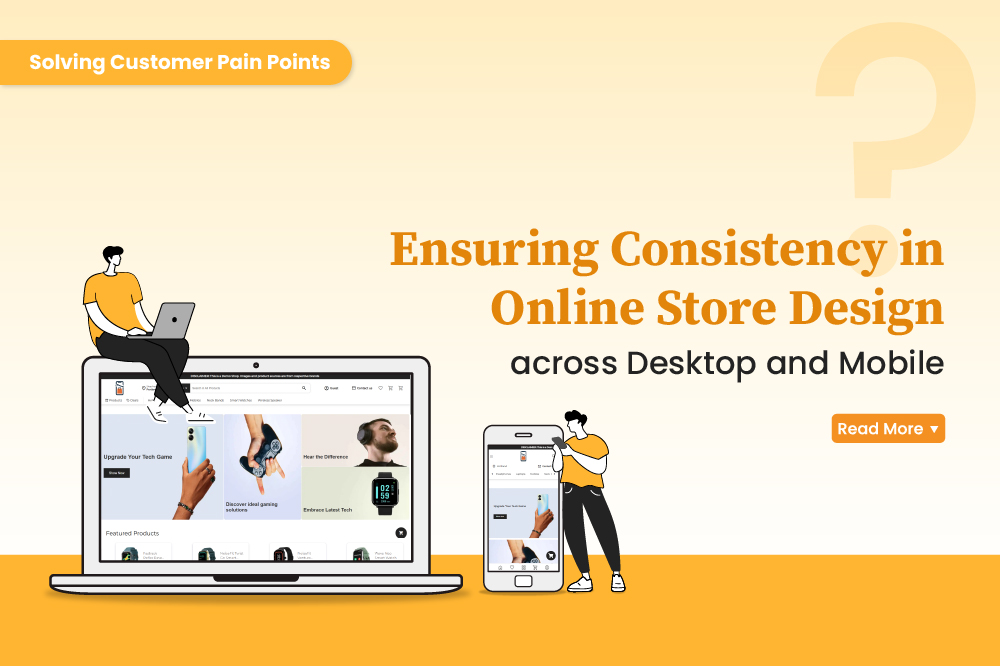
Is your store design inconsistent between desktop and mobile? You're not alone. Many online store owners struggle with creating a unified shopping experience across devices. With mobile commerce dominating the ecommerce landscape, design inconsistency can lead to frustrated customers, abandoned carts, and lost revenue.
The Importance of Consistency Across Desktop and Mobile Views
A mismatch in your store's design between desktop and mobile can confuse customers, disrupt their shopping journey, and weaken your brand identity. Key issues often include:
- Misaligned navigation buttons.
- Differing product category displays.
- Disparate checkout processes.
Customers expect the same seamless experience regardless of how they access your store. Meeting this expectation is crucial to retaining customers and driving sales.
How ZenBasket Solves Design Inconsistency
ZenBasket simplifies the challenge of maintaining consistency across desktop and mobile views. Here's how:
1. Responsive Templates for All Screens
ZenBasket offers a wide range of responsive pre-defined templates that adapt dynamically to the screen size, ensuring every element-from banners to buttons-is perfectly scaled. With these templates, your desktop design doesn't just shrink down for mobile; it transforms into a layout optimized for smaller screens, delivering an intuitive experience to mobile users.
2. Consistent Visual Branding
Maintaining your brand identity across devices is critical for recognition and trust. ZenBasket ensures your store's color schemes, fonts, logos, and imagery look identical across desktop and mobile views. This cohesion strengthens your brand and builds customer trust, as users feel familiar with your store no matter where they browse.
3. Uniform User Behavior Design
ZenBasket goes beyond aesthetics to unify functionality. Whether a customer is navigating product categories, using filters, or viewing a product detail page, their experience is the same on desktop and mobile. Actions such as adding products to the cart or searching for items behave identically, minimizing confusion and enhancing the overall user experience.
4. Mobile-First Checkout Design
The checkout process is one of the most critical steps in the shopping journey. ZenBasket's mobile-optimized design ensures that checkout forms, payment options, and order summaries are optimized for touchscreens while retaining the simplicity and flow of the desktop experience.
5. Preview and Edit Across Devices in Real-Time
ZenBasket's instant preview enables you to see how your store appears on different devices-desktop, tablet, and mobile-in real time. This is especially helpful for store owners who want to fine-tune their design and ensure that every visual element is perfectly aligned before publishing.
6. Speed Optimization for All Devices
Inconsistent design often leads to performance issues, such as slow loading times on mobile. ZenBasket optimizes your store's loading speed across all devices, ensuring that heavy design elements from the desktop version don’t hinder performance on mobile. Faster load times mean a better user experience and reduced bounce rates.
Closing Thoughts
ZenBasket doesn't just offer tools-it also provides expert guidance. The platform's setup help center guides you through creating a store design that maintains consistency across desktop and mobile. If you need assistance, the ZenBasket support team is always available to help you optimize your store's layout for different devices.
Inconsistent design between desktop and mobile views is more than an inconvenience barrier to success. By partnering with ZenBasket, you can deliver a unified, responsive shopping experience that keeps customers returning.
FAQ Section
1. What is the difference between desktop and mobile view?
Desktop view refers to the layout and design of a website or application optimized for larger screens, such as computers and laptops. It typically includes more detailed navigation, larger images, and multiple columns. Mobile view, on the other hand, is designed for smaller screens, such as smartphones and tablets. It features simplified layouts, touch-friendly buttons, and responsive elements that adjust to the limited screen size.
2. What is consistency in mobile app design?
Consistency in mobile app design refers to maintaining uniformity in how elements like colors, fonts, icons, and layouts appear and function throughout the app. It ensures that users experience the same behaviors and design patterns across all screens, reducing confusion and making the app easier to navigate.
3. What is consistency in visual design?
Consistency in visual design involves creating a cohesive look and feel across a website, app, or platform. It includes uniform use of typography, color schemes, imagery, and branding elements. Visual consistency strengthens brand identity, enhances user experience, and ensures a seamless transition between different sections or devices.
4. What is a desktop view on mobile?
Desktop view in mobile refers to accessing the desktop version of a website on a mobile device, typically by overriding the default mobile-optimized layout. This is often done for websites that lack mobile-friendly designs, but it can lead to usability issues due to small text, misplaced buttons, or unresponsive elements. A well-designed responsive site eliminates the need for this option.